Designing the DNA of a Gaming Community
Building Lysto’s Scalable Dual‑Mode Design Language System
A UI Design Case Study
Designed for
Pixelcrux Studio (Client: Lysto)
Written by
Rhythm Bhatnagar
Jul 5, 2025
A highly modular, dark/light mode-enabled Design Language System for a fast-growing gaming platform. Crafted to immerse competitive players and empower community managers, the DLS defined consistent components, tokens, and visual identity while remaining adaptable for future modules.
1. Foundation: Aligning Purpose, Players, and Personality
Goal:
To create a beautiful, cohesive interface that players could instantly recognize—even without a logo. The existing platform was inconsistent across screens, fonts, and components.
Target Users:
Competitive Gamers — socially active, mostly offline, returning for leaderboards and rewards
Admins & Moderators — managing tournaments, scrims, and community chats
Design Principles:
Aesthetic: Purple–pink gamer dungeon meets futuristic cyber UI
Speed: Fast replay and interaction flows
Rewards: High emotional gratification via badges, feedback, and glow
Accessibility: Full support for light/dark mode toggle
Consistency: Every screen should feel like Lysto, logo or not
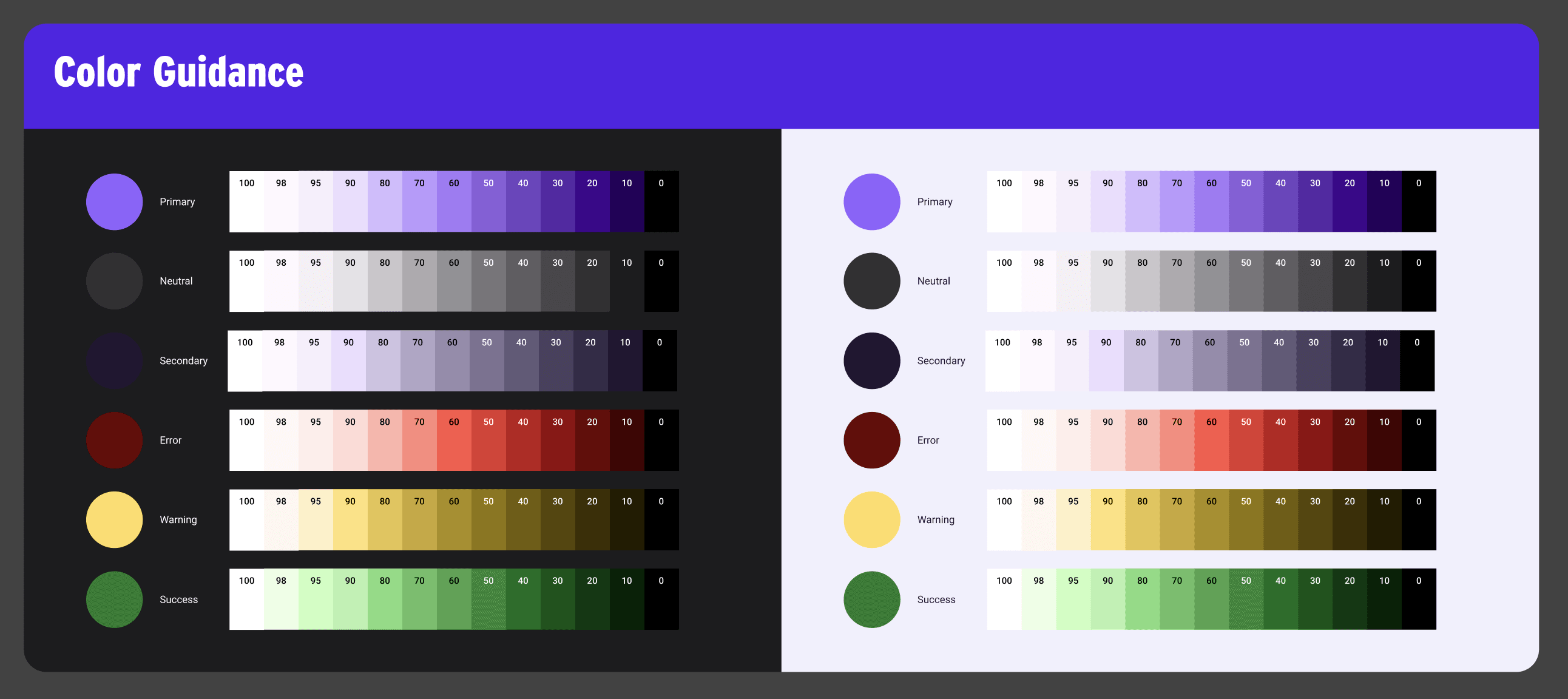
2. Design Tokens: Creating the Raw Materials
Color System:
Neutral scale: 12 shades of gray + color-grays (gray + hint of purple)
Primary color: Purple, in high-saturation and low-saturation ranges (12 each)
Semantic colors:
Green (success) – 12 tones
Red (error) – 12 tones
Yellow (info/warning) – 12 tones
Each tone was tested on light and dark backgrounds during real-world component design, with iterative refinements.
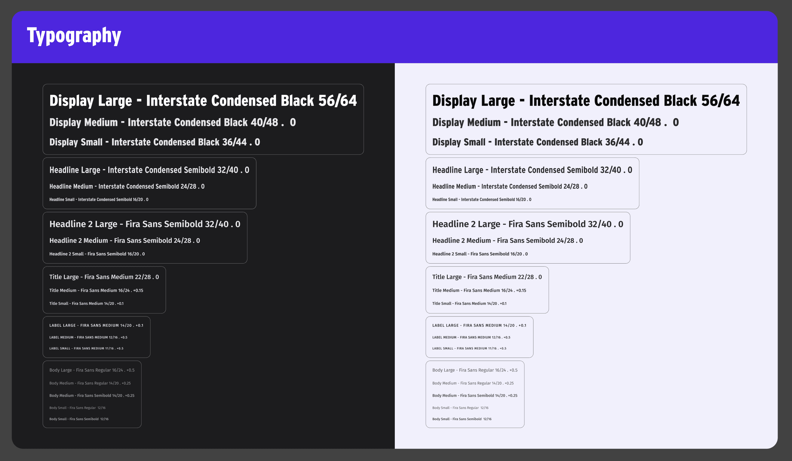
Typography:
Interstate Condensed — For compact, high-information titles (e.g., tournament names)
Fira Sans — For legibility in body text, forms, and status messages
Spacing & Grid System:
Spacing scale: 4px base (4, 8, 16, 24, etc.)
Mobile padding: 16px L/R consistently
Grids: 4-column (mobile), 8/12-column (desktop)
Radius: 4px (inputs/buttons), 12–16px (cards), 999px (avatars)
Elevation levels: 0–3 used across cards, modals, tooltips with shadows/glows based on theme
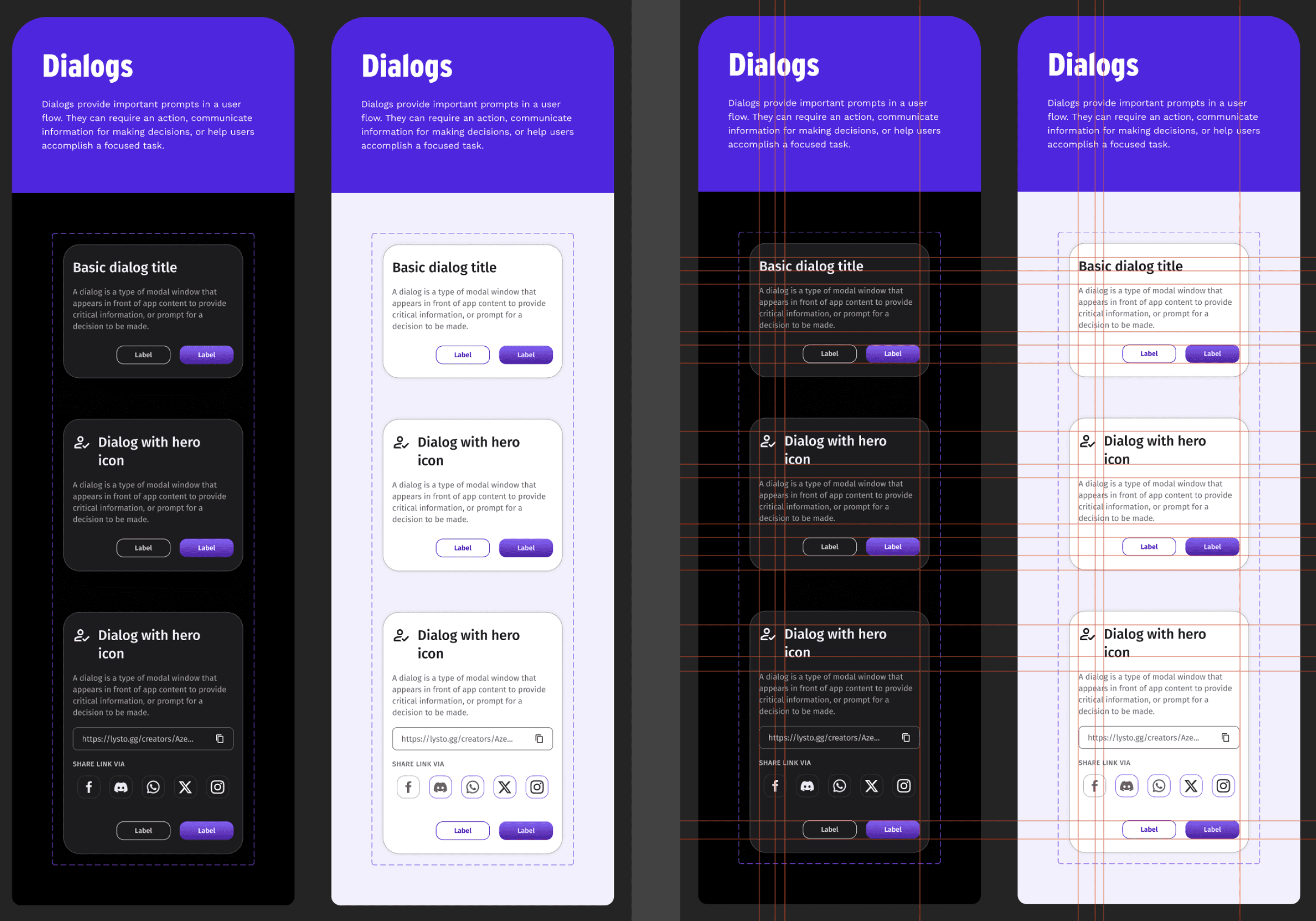
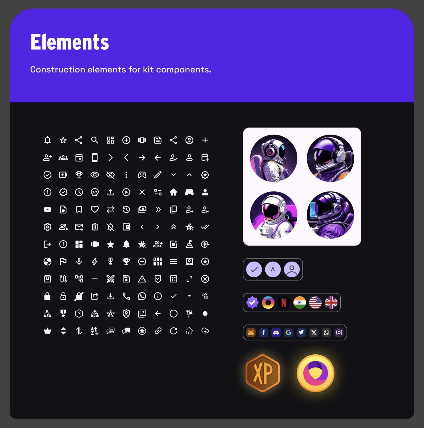
Components: Atoms to Organisms
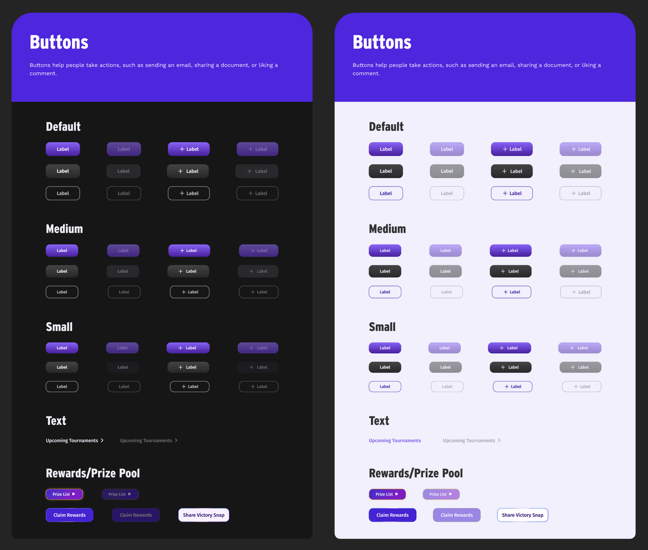
Buttons:
Types: Primary, Secondary, Tertiary, Text, Special (glitzy)
States: Default, Hover, Pressed, Inactive
Themed for both light/dark using Figma variables
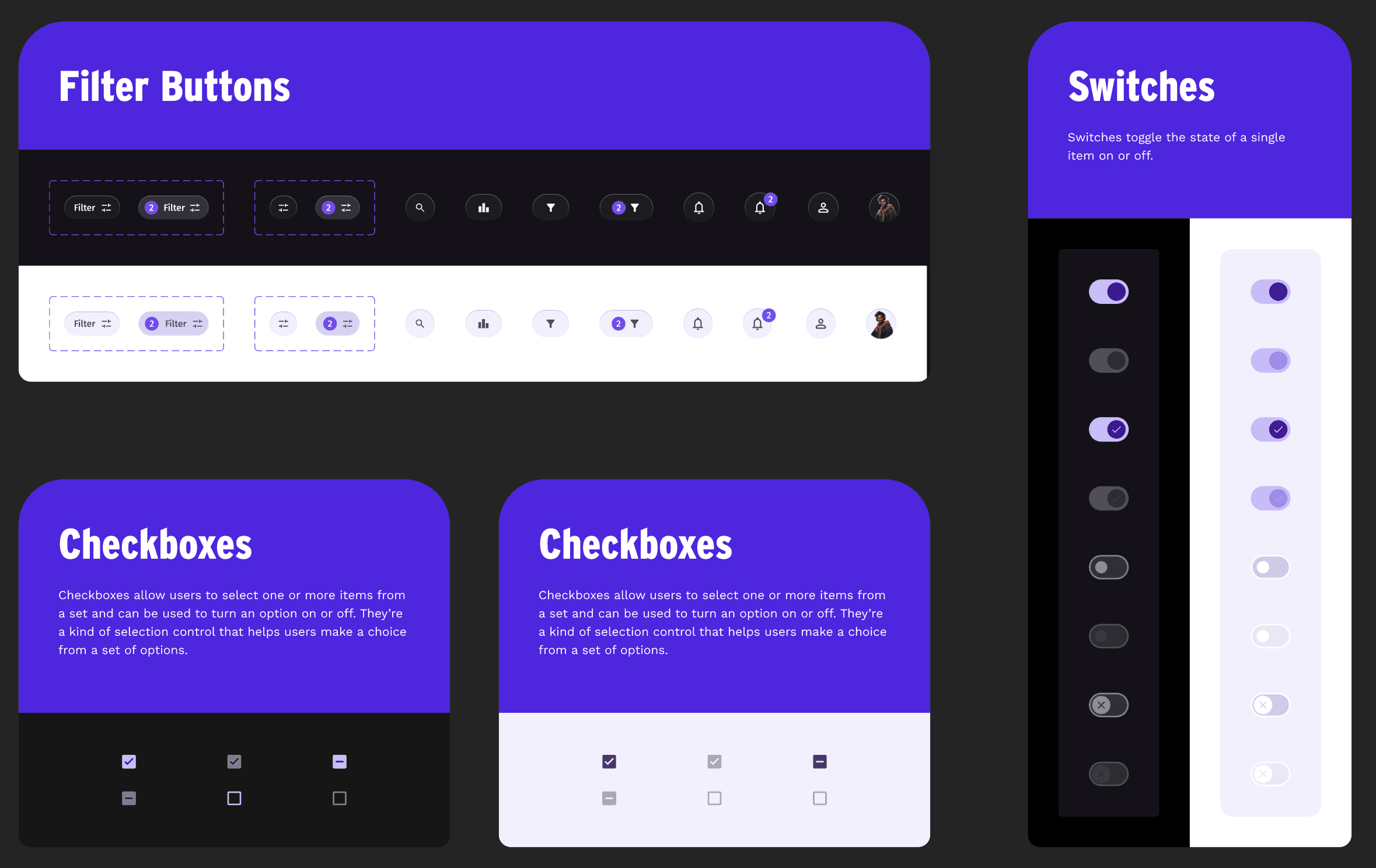
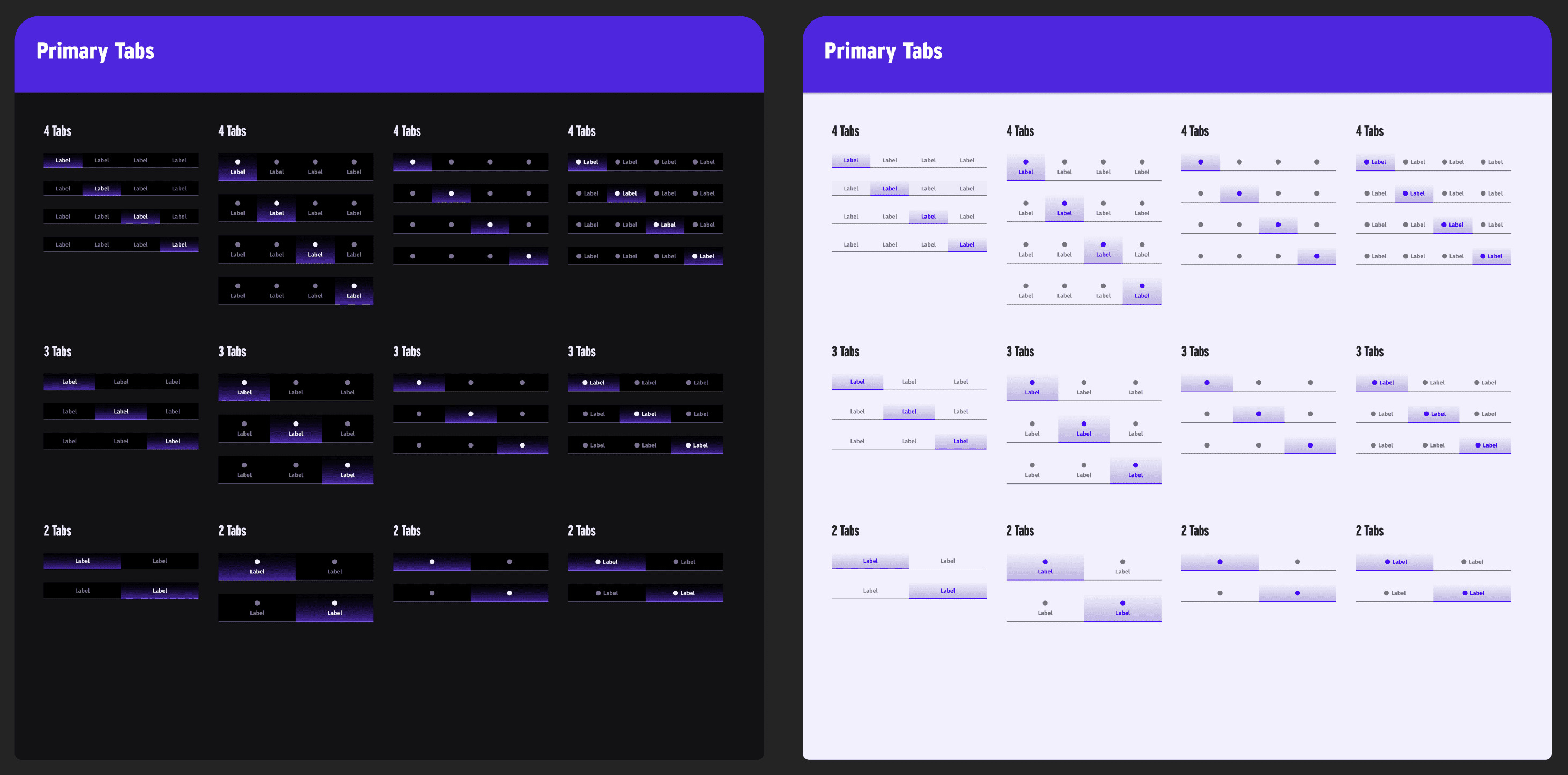
Tabs:
Primary tabs (2, 3, 4): For high-level navigation
Secondary tabs: Used for subviews or filters
Hierarchy tested with one set placed under another

Input Elements:
Text fields with: default, active, input filled, error, info, disabled
Visual mobile keyboards for both themes

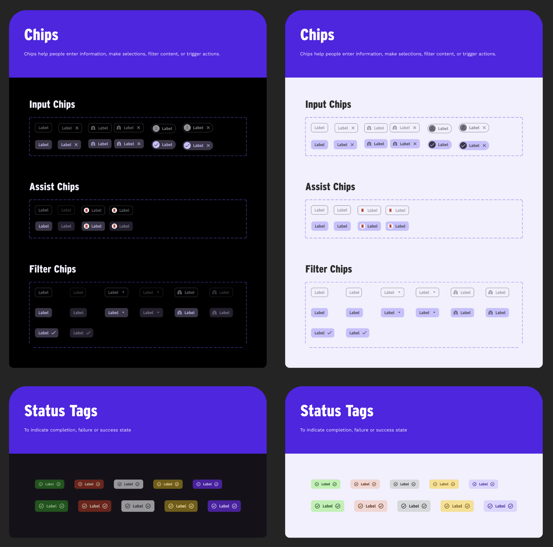
Status Chips, Tags, Badges:
Color-coded:
Green – Confirmed
Yellow – In Progress
Red – Closed/Error
Designed post feedback from players about lack of status clarity
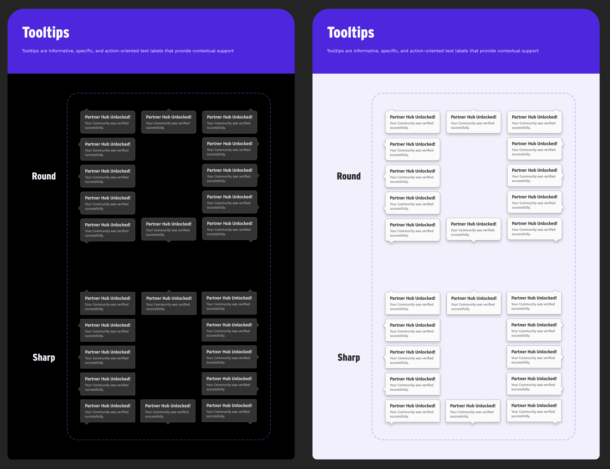
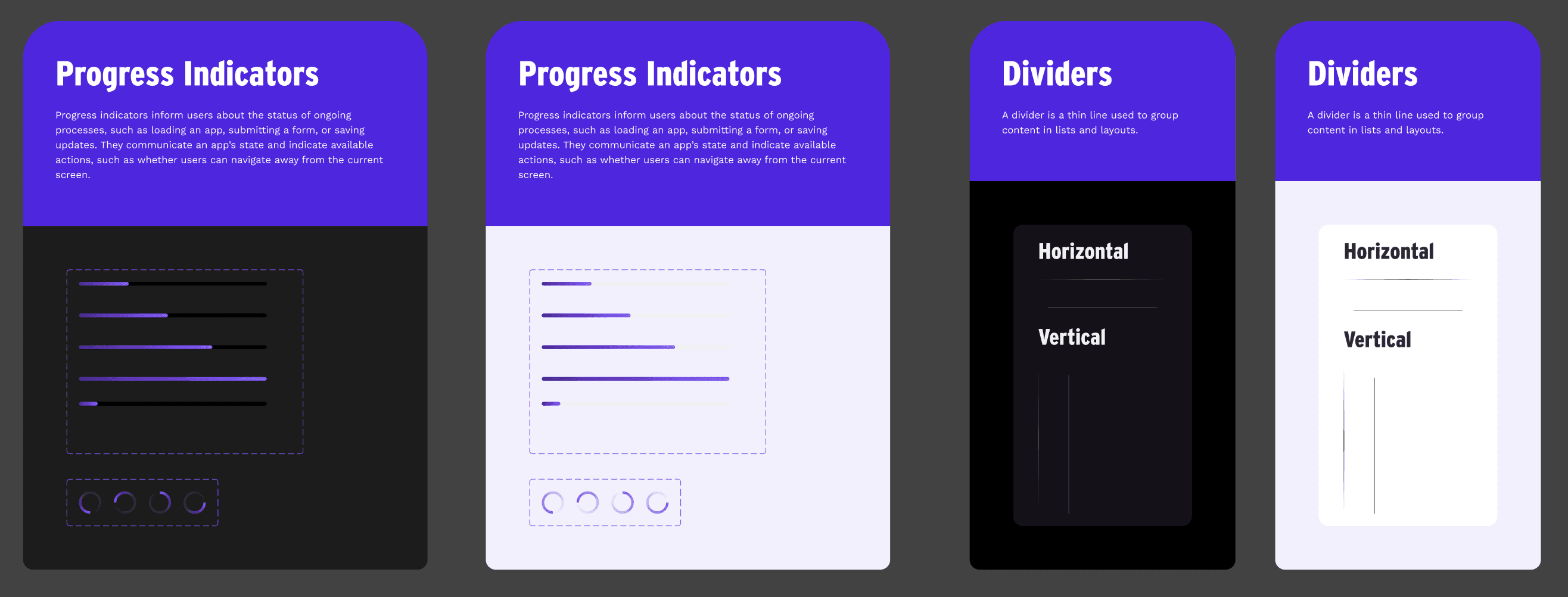
Loaders & Progress:
Progress bars: Horizontal purple gradients
Spinners: Circular purple loaders
Used across loading states and reward flows
Avatars & Iconography:
Avatars: Spaceman-themed for playful identity
Icons: Created for tournaments, XP, scrims, Lysto currency, rewards
Matched on thickness, scale, and stroke style
4. Testing, Accessibility & Iteration
Used WCAG tools and plugins for contrast, font legibility, and color blindness checks
Theme switching tests across real flows
Usability tests with gamers and admins:
Iterated tournament status badges based on feedback
Adjusted spacing in visual keyboards for finger touch zones
5. Documentation & Dev Collaboration
Design System File:
One DLS Figma file which had:
Multiple Component pages: Buttons, Colors, Typography, Status Indicators, Elevated UI, etc.
One Workspace page for in-progress design work on any new UI using the DLS components.
Post design completion, final design flows were moved to a GTM (Go to Market) file.
Developer Handoff:
Documentation: Google Slides + in-person walkthroughs
Figma variables were used throughout to ease implementation for easy switching between states and themes.
Developers participated in component adjustments post-DLS launch, so DLS kept getting updated in the coming months.
6. Governance & Future-Proofing
Edit control: Only design leads could update DLS
New additions required design lead approval
Guidelines ensured new games/modules followed the same visual DNA
Conclusion: A Living System
Lysto’s DLS wasn't just a component library—it was a flexible identity engine that helped deliver immersive, consistent, and accessible gaming experiences. With dual themes, structured tokens, collaborative iteration, and deep testing, the DLS allowed the brand to scale confidently into new features and community modules.
Want a Design System like this for your platform?
Schedule your first free consultation call now!