Turning Visitors into Power Users: Structuring 3 Onboarding Journeys into One Seamless Flow for Expand.Network
Web3 sci-fi game where players stake tokens, explore planets, and build colonies through gamified liquidity pool mechanics.
A UX Design Case Study
Designed for
Pixelcrux Studio (Client: Lysto)
Written by
Rhythm Bhatnagar
Jun 19, 2025
Platform Type: DeFi Developer SaaS
Role: UX Lead
Scope: End-to-end onboarding UX across 3 user cohorts
Deliverables: Complete onboarding user journey from website to internal dashboard, including login, plan selection, and edge case design
The Challenge
Expand.Network offered a powerful DeFi API platform, but visitor retention was low. A significant portion of potential users dropped off between landing on the site and reaching first product interaction.
The goal was to ensure that every kind of visitor left with something useful, increasing the chances of return and engagement. To achieve this, onboarding needed to accommodate multiple intents without creating friction.
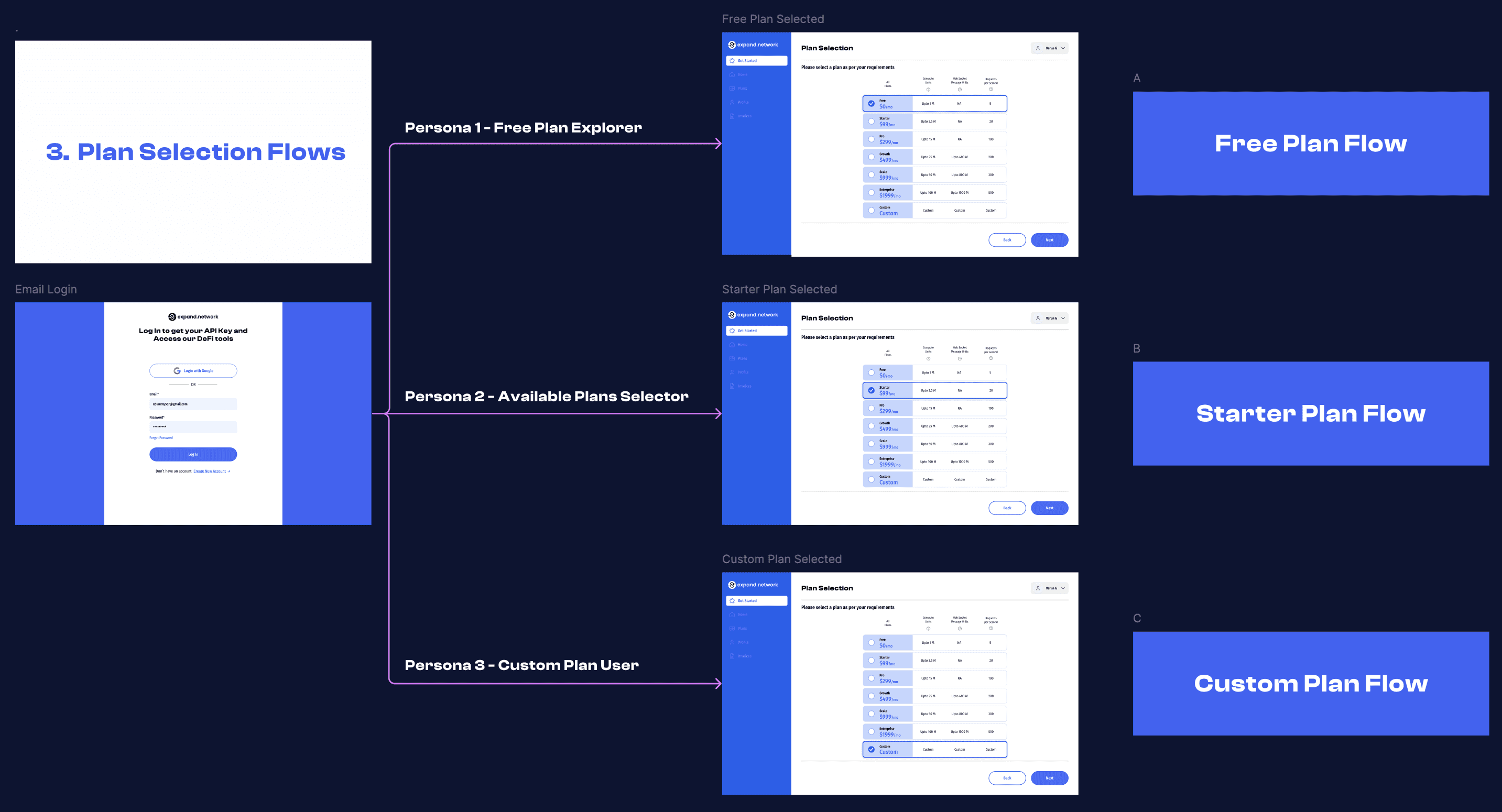
Identifying the 3 Personas
Three primary user personas were identified through stakeholder interviews and early user behavior data:
Persona | Intent | Key Need |
🟢 Free Plan Explorers | Just checking the product | Fast access to a free API key |
🟡 Available Plan Purchasers | Clear plan intent | Comparison and checkout clarity |
🔴 Custom Needs Users | Flexible or enterprise needs | Contact + temporary free access |
This understanding informed the structure of multiple tailored onboarding flows — all converging toward activation.
The Entry Point
All onboarding journeys began from the "Get API Key" call-to-action on the marketing website. This CTA led directly to the login screen.
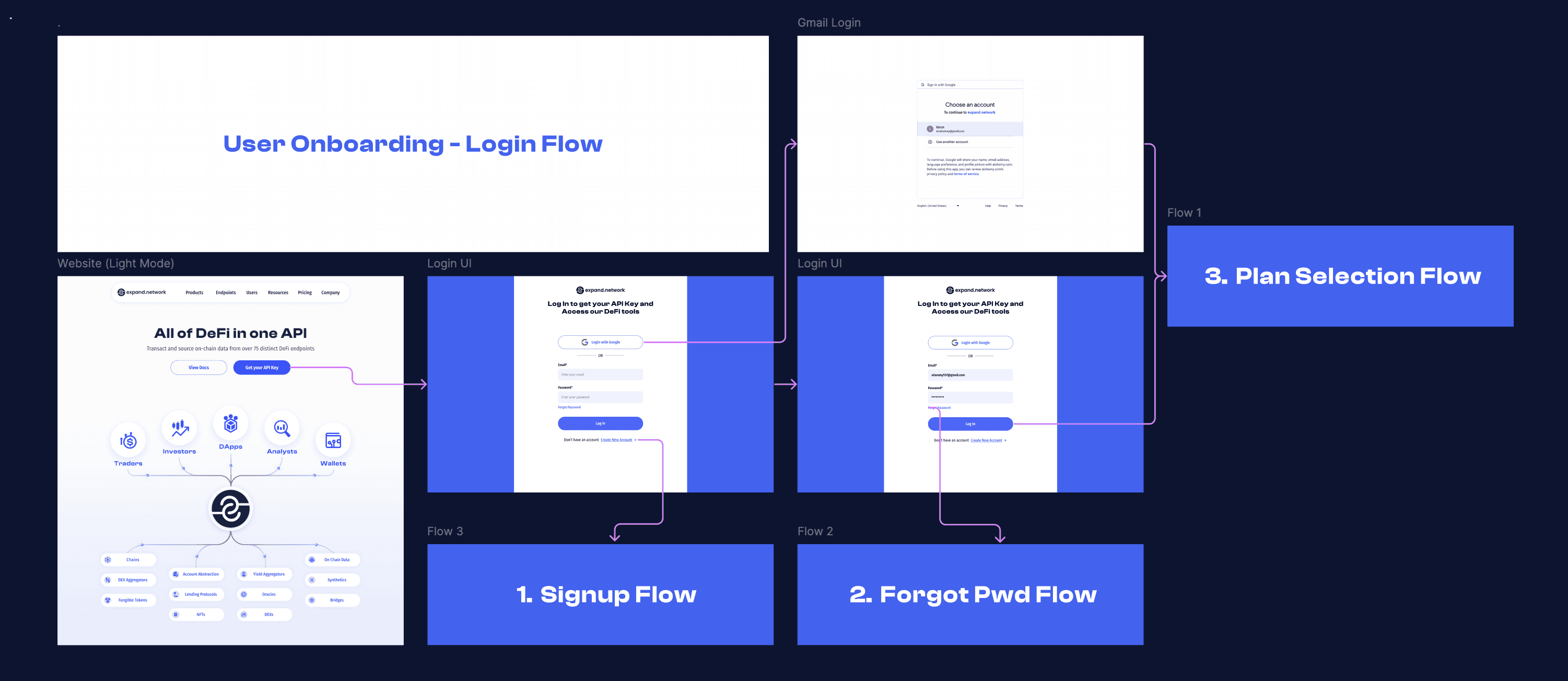
Authentication Flows
Three core pathways were created on the login screen:
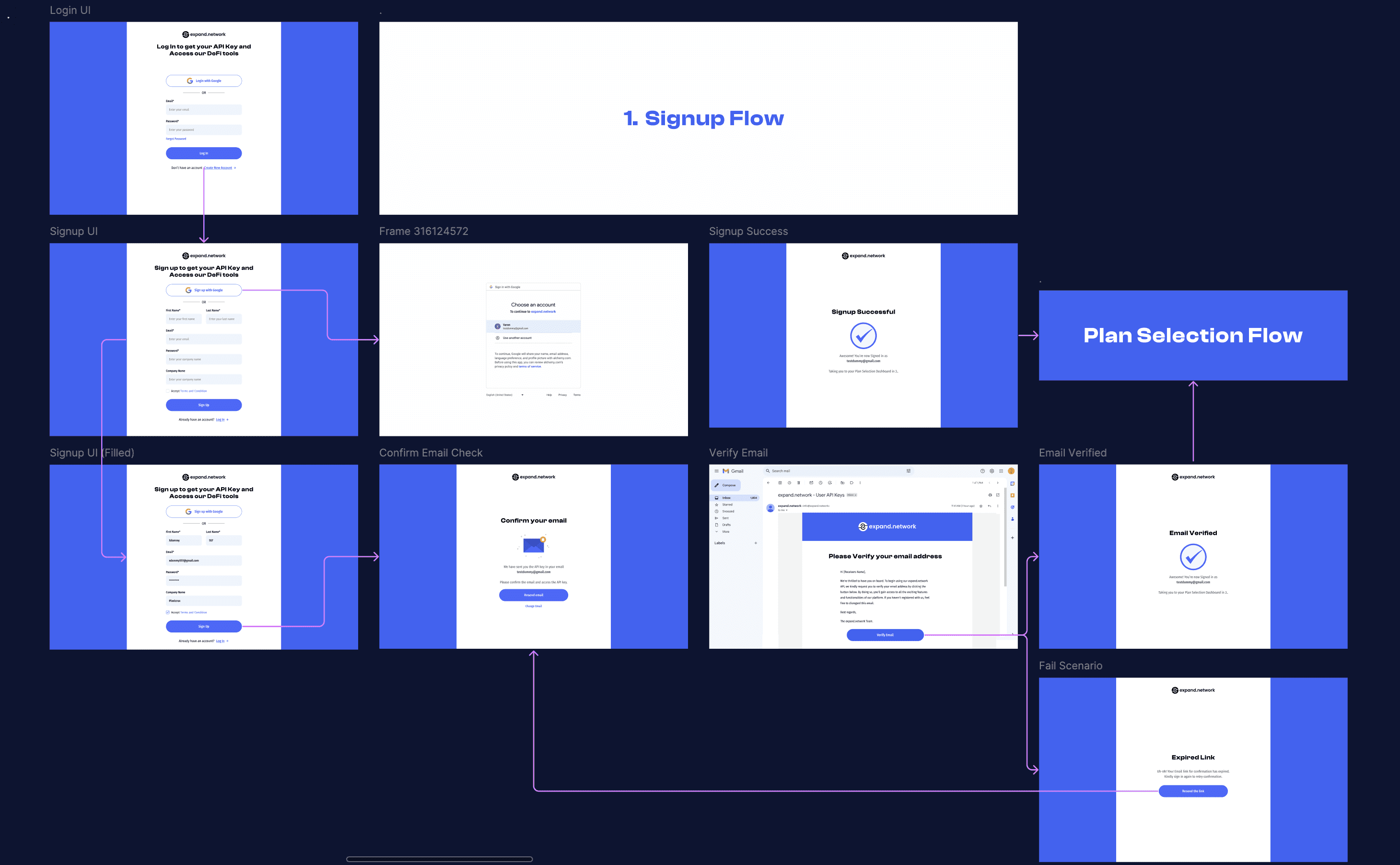
Signup Flow — for new users
Login Flow — for existing users
Forgot Password Flow — for recovery scenarios

Capturing an email address at this stage was essential for user tracking, onboarding analytics, and direct communication, especially during early product iterations.
The Plan Selection Decision Point
After login, all users were routed to the Plan Selection UI, featuring seven total plans:
1 Free Plan
5 Paid Plans
1 Custom Plan
The screen presented all tiers upfront, along with relevant microcopy, tier-specific metrics, and tooltips explaining technical terms.
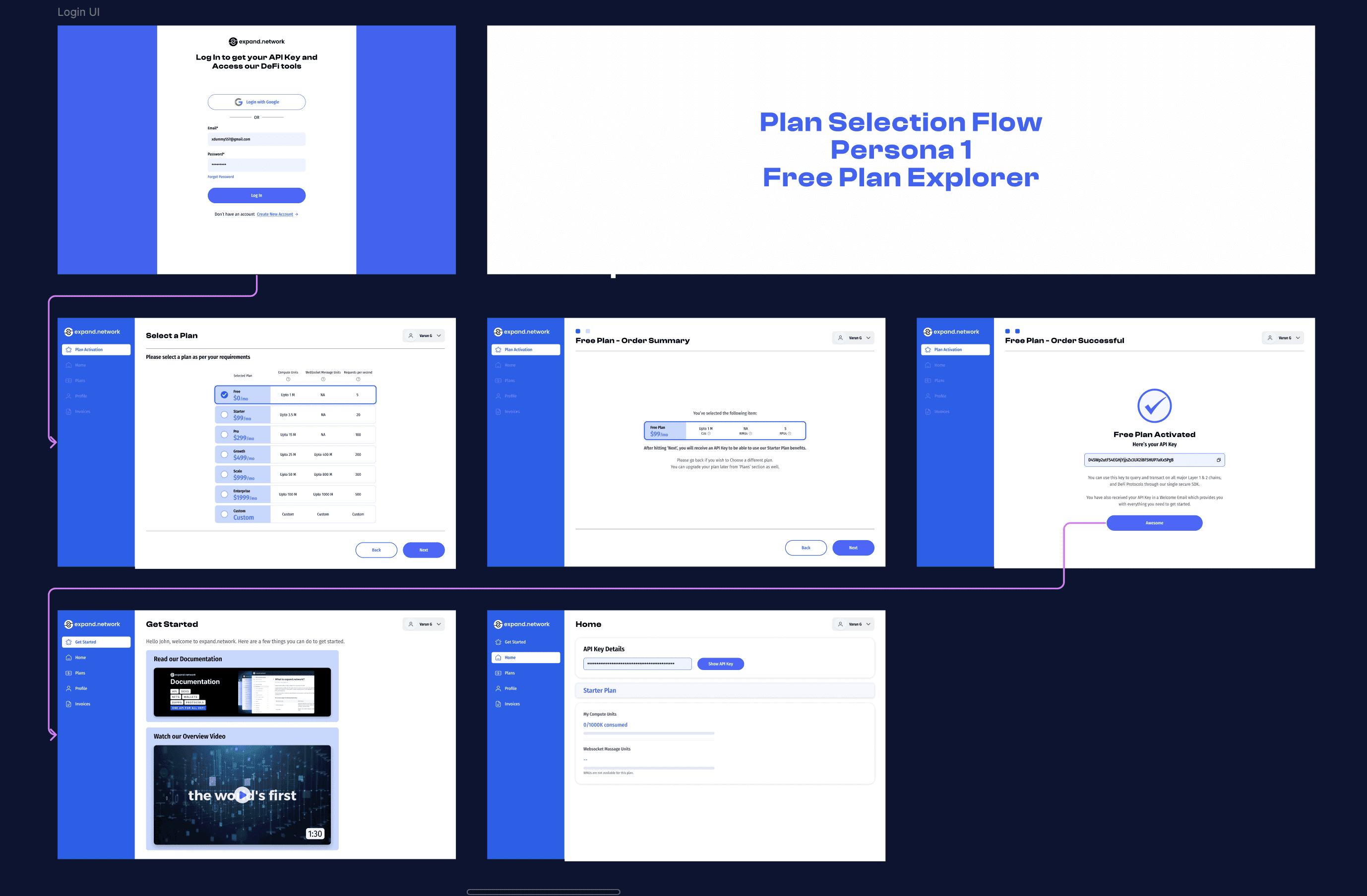
Flow 1: Free Plan Explorers
Users who selected the Free Plan were routed directly to the API Key screen, without requiring additional steps or friction. This reduced drop-off and enabled product trial immediately.
Flow 2: Available Plan Purchasers
Plan evaluation and purchase intent were addressed through:
A plan comparison UI
Hover-based tooltips explaining complex terms
A structured flow:
Plan Selection
Add-on Selection
Order Summary
Payment Completion
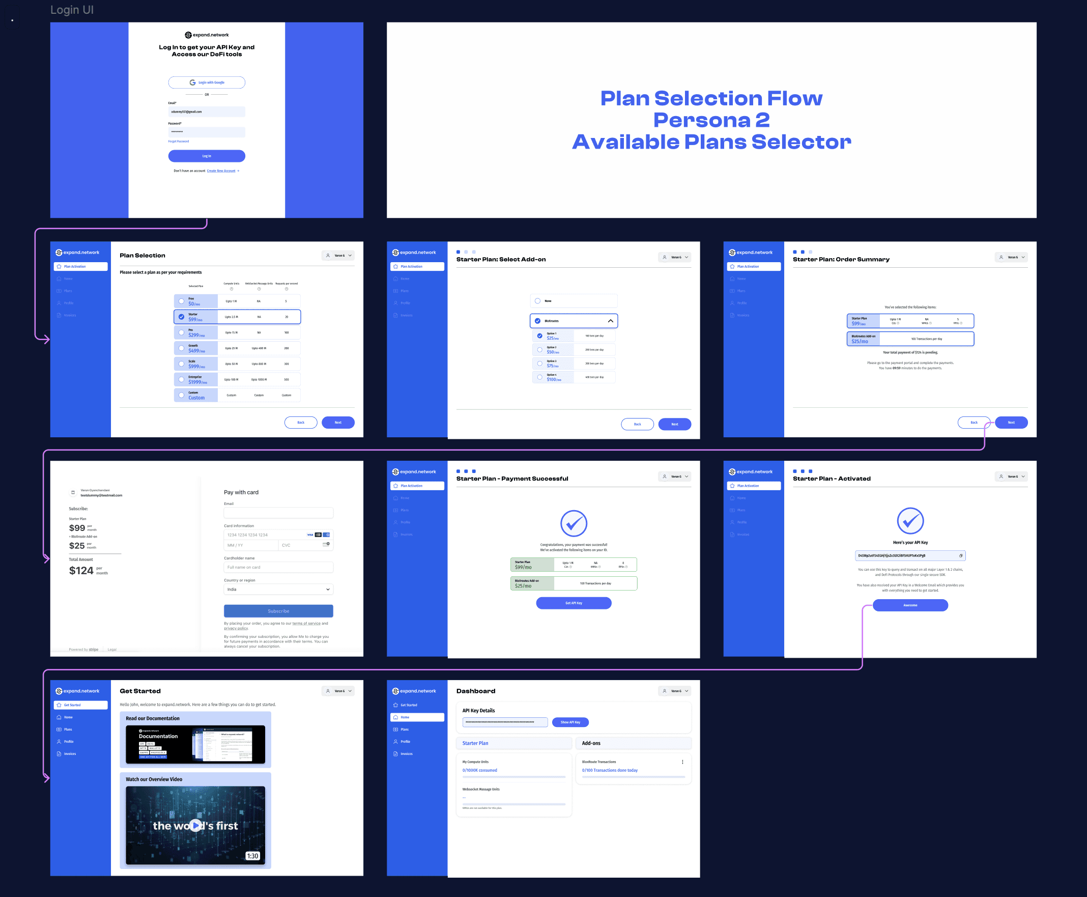
Fallback screens for payment failures and retry options were also implemented.
Flow 3: Custom Needs Users
Users with non-standard requirements were given the option to choose a Custom Plan. Upon selection:
An internal record was triggered to notify the support/sales team.
While awaiting outreach, users were provisioned with the Free Plan to begin exploring.
This ensured users remained engaged even before human follow-up occurred.

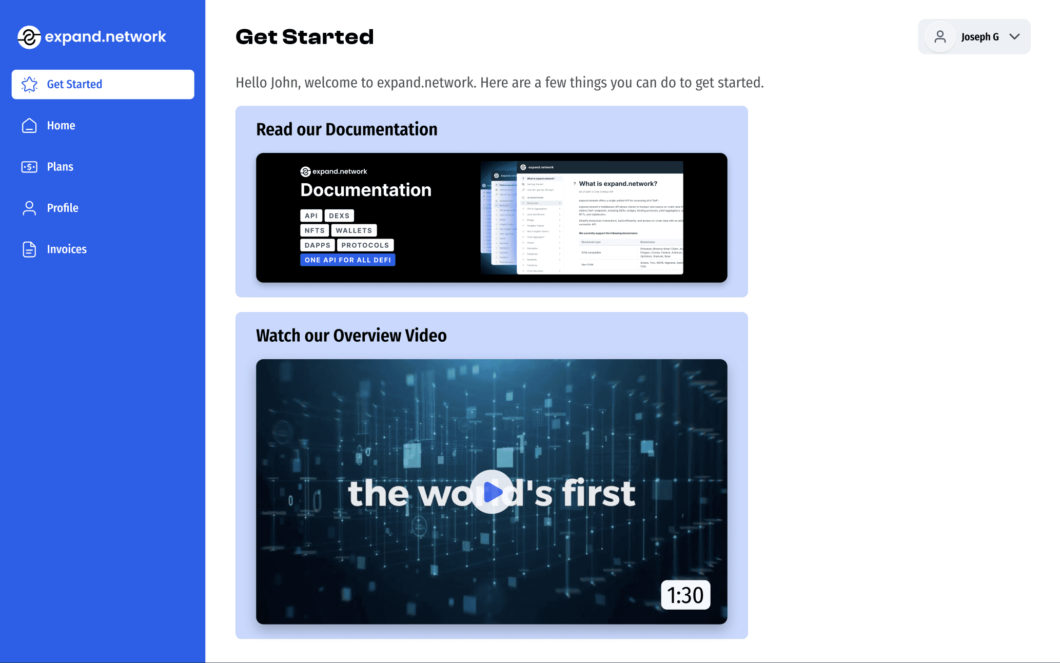
Post-Onboarding: First Experience with the Dashboard
All onboarding paths converged at the Get Started tab within the internal dashboard — designed as an activation layer.
Key components included:
Quick-start video tutorials
Detailed documentation on API use cases
Highlighted account metrics (Compute Units, WebSocket Units, Add-ons)
Additional tabs included:
Home
Profile
Plans
Invoices
Designing Edge Case Flows
Edge scenarios were planned and prototyped alongside core flows. These included:
Payment failures
Network errors
Confirmation states
Tooltips for clarification
Retry logic for failed actions
This approach reduced support tickets and built trust in the early-stage product.
UX Strategies That Worked
Key differentiators in this onboarding design:
Multiple flows within a single modular system
Helpful defaults and optional guidance instead of forced detours
Edge case and error resilience from the first version
A fast, no-commitment trial path for skeptics
Transparent language and visual cues around pricing
Takeaway
When a platform serves multiple user intents, personalized onboarding flows can dramatically improve activation and retention — without bloating the system.
Clear intent recognition, streamlined fallback paths, and immediate value delivery were central to converting visitors into product users.
Are you looking for a custom UX flow design for your Web3 Product?
Schedule your first free consultation call now!